How To Use The Dulux Colour Of 2024 In Your Decor

Interior needing a bit of an update? Here’s how to use the Dulux Colour Of 2024 in your home decor
By Diane Small
We all need change every now and then. Change in our look, our wardrobe, and in our home. And one of the easiest ways to give your home an update is simply with paint.
As with fashion trends, home trends change every now and then. And that’s especially true in terms of colour. No one knows that better than paint brand, Dulux.
For the past 21 years, Dulux has announced their Colour of the Year based on extensive trends research conducted by the brand and international design professionals.
For 2024, Dulux’s Colour of the Year reflects people’s need for simplicity, meaning and a sense of belonging.
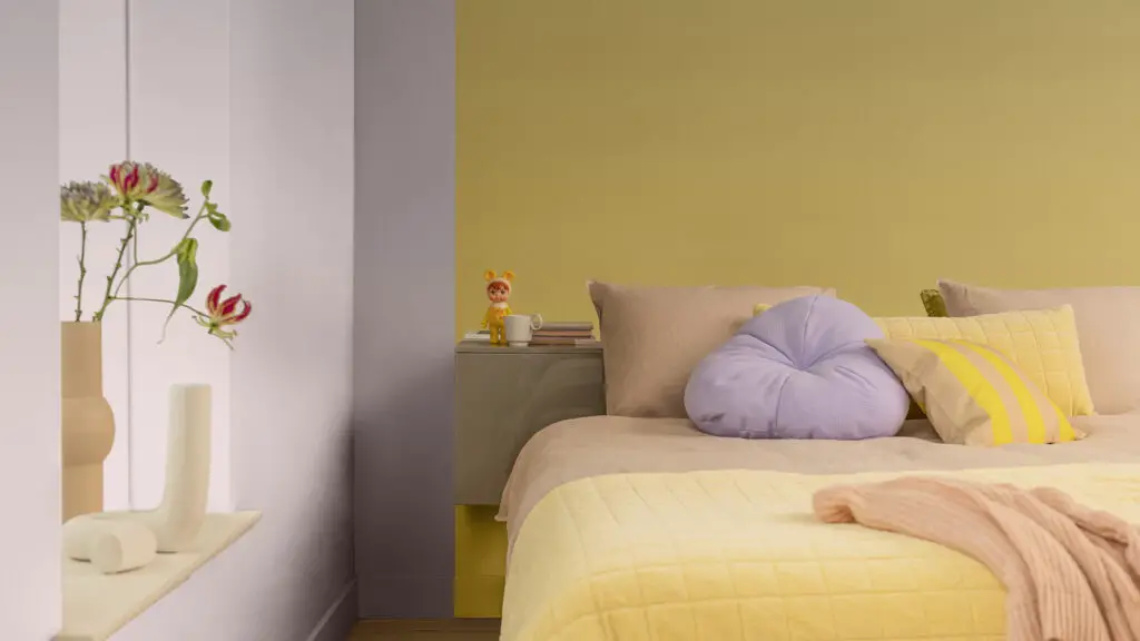
Marianne Shillingford, Colour Expert and Creative Director at Dulux, explains: “What is so wonderful about Sweet Embrace is its soothing subtlety. While being a beautiful standalone colour, it’s a hue that matches perfectly with so many other shades so that decorators can use it as a backdrop to build a totally individual space upon.”
That’s all fine and well. But how can the average person, with no professional decorating experience, incorporate the Dulux Colour of 2024 into their decor?
We asked two experts, James Roberts, Director at Sanctuary Bathrooms, and Johanna Constantinou, Brand and Communications Director at Tapi, for their advice.
Here below, are their tips on how to use ‘Sweet Embrace’ into your home.
5 Tips For Using Sweet Embrace In Your Home
1. Use complimentary colours
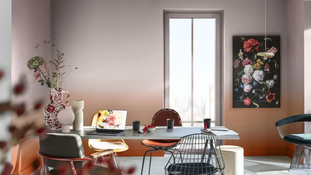
The Dulux Colour of 2024 is easy to pair with other colours. James says: “With ‘Sweet Embrace’ being such a muted and earthy shade of pink, it leaves a lot of room for experimentation and exciting colour combinations. Other earthy tones will work nicely with this shade, such as browns, greys, and greens. This will create a grounding and calming space and also naturally make any room look slightly larger than if you were to use bolder colours.”
Additionally, because it is a pink tone, other pinks will work really well with it such as powder or baby pink. Experimenting with varying shades of pink helps to achieve a sense of femininity, which can be really inviting in a space such as the bedroom.
Johanna says: “Pairing low toned pink with bolder colours can create a visually striking and balanced colour palette. Deep greens, navy blues, rich purples or even darker shades of grey can create a contrast and balance when paired with muted pinks.”
If you’re hesitant about using bold colours, start by incorporating them as accents. This can be through accessories such as pillows and will add vibrancy without overwhelming the overall design.
2. Think about details
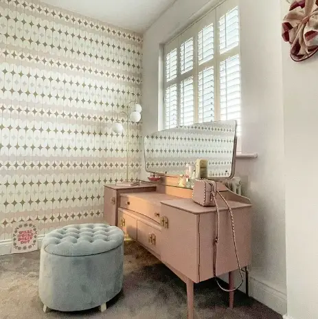
You don’t need to paint your whole house a new shade to make it look fresh. To use the Dulux Colour of 2024 as an update for your home, you can just paint a few things, such as pieces of furniture, one small room, or a feature wall.
Alternatively, James says: “If you’re someone who prefers a bolder interior, there’s no reason why you can’t use ‘Sweet Embrace’ to enhance a maximalist look. With it being a pale shade, it stands out against darker colours. So consider adding it in furnishings such as wall prints, curtains, blinds, and cupboards or vanities. You could also use the colour for tiling inside your shower. It also looks great against contrasting black, brass, or gold fixtures.”
Johanna adds: “Bold furnishings often stand out best against a contrasting background. If your furnishings are bold and colourful, opt for a neutral flooring colour that contrasts with them. For example, pair vibrant wall prints with light grey or white flooring. Warmth is still important, and you can bring that in with textiles and darker shades.”
3. Create a calming sanctuary
Pink and violet have long been considered calming colours. And we all need a calming environment these days more than ever.
James says: “In recent years, there’s been much more value placed on how our homes makes us feel, due to the rise in working from home. Pairing this colour with soft furnishings such as cloud-like cushions, flowers and feathers, and warm lighting creates ambience and a space you’ll be excited to unwind in.”
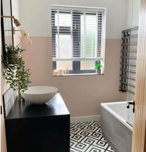
He adds that one of his best tips on how to use the Dulux Colour of 2024 is in a surprising place: the bathroom.
“(This colour) works particularly well for bathrooms. That’s because this room is one in which you’ll want to decompress and appreciate some time to yourself. This is a perfect colour to adorn your walls with to make bathing an even more relaxing experience,” he states.
Johanna says: “To further make your home a calming space, incorporate natural materials such as light wood, bamboo or rattan furniture. This will also help prevent the space from feeling overwhelming. Natural materials balance the pastel pink with neutral colours such as white, cream and beige. These colours will also create a sense of visual harmony and balance.”
4. Play with light
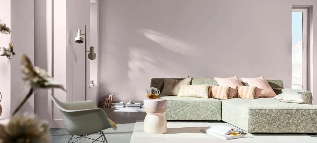
One of the best tips on how to use the Dulux Colour of 2024 at home is to place it where it looks best in different lights.
James says: “According to Dulux, ‘Sweet Embrace’ takes on different tones in different lights. This means you can be clever with where you use the colour. Positioning it on a wall opposite a window will bring out it’s soft, calming tone. But in the shadows, it produces a more moody violet shade. This makes it really adaptable, depending on the desired tone of the room.”
Johanna agrees. She suggests considering using table lamps or pendant lights with a soft diffused light to rock the hue harder. “You can also layer your lighting to add depth and versatility. Combine ambient lighting (ceiling lighting) with task lighting (reading lights) to provide different levels of illumination and alter the tones,” she says.
- How To Do Boomer Brown Tones In Your Home - May 5, 2025
- How To Create An Eco Friendly Nursery - April 21, 2025
- How To Do The Olive Green Colour Trend At Home - March 13, 2025


